
Part 7: Player screens
Now that we have our settings system in place, it’s time to build the heart of our music app - the playlist and player screens. We’ll create a complete music browsing experience with proper TypeScript types, mock data, and dynamic navigation between screens.
By the end of this part, you’ll have a functional music app that displays a list of songs and allows users to navigate to a detailed player view for each track.
Setting Up Types and Mock Data
Before we can build our screens, we need to establish the data structure for our songs. This step is crucial for maintaining type safety throughout our application and ensuring that our components receive the expected data format.
Let’s start by creating the fundamental types that will power our music app.
Create Song Types
First, we’ll define what a song looks like in our application. Each song needs essential information like title, genre, cover image, and duration.
Create types/song.ts:
export type Song = {    id: number,    title: string,    genre: string,    imageUrl: string,    duration: string}
export type Playlist = Array<Song>
Now let’s create an index file to make imports cleaner throughout our app.
Create types/index.ts:
export * from './song'Create Mock Playlist Data
For this tutorial, we’ll use a curated list of 20 fictional songs with diverse genres to showcase our app’s capabilities. In a real application, this data would come from an API or music service.
Create mocks/playlist.ts:
import { Playlist } from '@/types'
export const playlist: Playlist = [  {    "id": 1,    "title": "Midnight Bloom",    "genre": "Dream Pop",    "imageUrl": "https://picsum.photos/200/300",    "duration": "03:42"  },  {    "id": 2,    "title": "Neon Skyline Drive",    "genre": "Synthwave",    "imageUrl": "https://picsum.photos/200/300",    "duration": "04:15"  },  {    "id": 3,    "title": "Forgotten Lullaby",    "genre": "Indie Folk",    "imageUrl": "https://picsum.photos/200/300",    "duration": "02:58"  },  {    "id": 4,    "title": "Electric Serenade",    "genre": "Electropop",    "imageUrl": "https://picsum.photos/200/300",    "duration": "03:21"  },  {    "id": 5,    "title": "Crimson Tide Rhapsody",    "genre": "Orchestral Rock",    "imageUrl": "https://picsum.photos/200/300",    "duration": "04:55"  },  {    "id": 6,    "title": "Static Echo Chamber",    "genre": "Noise Rock",    "imageUrl": "https://picsum.photos/200/300",    "duration": "02:30"  },  {    "id": 7,    "title": "Whispers in the Algorithm",    "genre": "Glitch Hop",    "imageUrl": "https://picsum.photos/200/300",    "duration": "03:50"  },  {    "id": 8,    "title": "Galactic Ballroom Blitz",    "genre": "Space Disco",    "imageUrl": "https://picsum.photos/200/300",    "duration": "04:38"  },  {    "id": 9,    "title": "Shadows of Yesterday",    "genre": "Gothic Rock",    "imageUrl": "https://picsum.photos/200/300",    "duration": "02:45"  },  {    "id": 10,    "title": "Renegade Heartbeat",    "genre": "Punk Rock",    "imageUrl": "https://picsum.photos/200/300",    "duration": "02:45"  },  {    "id": 11,    "title": "Emerald City Blues",    "genre": "Jazz Fusion",    "imageUrl": "https://picsum.photos/200/300",    "duration": "04:05"  },  {    "id": 12,    "title": "Lunar Labyrinth",    "genre": "Ambient Techno",    "imageUrl": "https://picsum.photos/200/300",    "duration": "05:00"  },  {    "id": 13,    "title": "Stone Cold Symphony",    "genre": "Hard Rock",    "imageUrl": "https://picsum.photos/200/300",    "duration": "03:33"  },  {    "id": 14,    "title": "Celestial Caravan",    "genre": "World Music",    "imageUrl": "https://picsum.photos/200/300",    "duration": "04:22"  },  {    "id": 15,    "title": "Velvet Revolution",    "genre": "Soul",    "imageUrl": "https://picsum.photos/200/300",    "duration": "02:17"  },  {    "id": 16,    "title": "Binary Sunset Dreams",    "genre": "Chillwave",    "imageUrl": "https://picsum.photos/200/300",    "duration": "03:08"  },  {    "id": 17,    "title": "Rusted Gears and Broken Hearts",    "genre": "Industrial",    "imageUrl": "https://picsum.photos/200/300",    "duration": "04:48"  },  {    "id": 18,    "title": "Sapphire Rain Dance",    "genre": "Trance",    "imageUrl": "https://picsum.photos/200/300",    "duration": "02:51"  },  {    "id": 19,    "title": "Concrete Jungle Ballad",    "genre": "Hip Hop",    "imageUrl": "https://picsum.photos/200/300",    "duration": "03:19"  },  {    "id": 20,    "title": "Infinite Horizons Calling",    "genre": "Progressive Metal",    "imageUrl": "https://picsum.photos/200/300",    "duration": "04:30"  }]
We’re using placeholder images from Picsum Photos, which provides random images perfect for mockups. Each song has a unique ID that we’ll use for navigation, and the variety of genres will help showcase how our components handle different types of content.
Create the barrel export for mocks:
export * from './playlist'This gives us clean access to our mock data throughout the application with simple imports.
Building the Playlist Screen
Now that we have our data structure in place, let’s transform the placeholder home screen into a proper playlist that displays our collection of songs. The playlist will serve as the main entry point where users can browse and select tracks.
Currently, our home screen at app/(tabs)/index.tsx just displays a simple title. We need to replace this with a scrollable list of songs that users can interact with.
Let’s update the playlist screen to display our songs:
 import { SongTile } from '@/components/SongTile'import { ThemedText } from '@/components/ThemedText' import { playlist } from '@/mocks' import { router } from 'expo-router' import { ScrollView, View } from 'react-native' import { ScrollView } from 'react-native'import { StyleSheet } from 'react-native-unistyles'
export default function PlaylistScreen() {  return (     <View style={styles.container}>         <ScrollView contentContainerStyle={styles.contentContainer}>           <View style={styles.header}>             <ThemedText type="title">               Playlist             </ThemedText>           </View>           {playlist.map(song => (             <SongTile               song={song}               onPress={() => router.push(`/(tabs)/player/${song.id}`)}               key={song.id}             />           ))}       </ScrollView>     </View>     <ScrollView contentContainerStyle={styles.container}>       <ThemedText type="title">         Playlist       </ThemedText>     </ScrollView>  );}
 const styles = StyleSheet.create((theme, rt) => ({   container: {     marginTop: rt.insets.top + theme.gap(3),     backgroundColor: theme.colors.background   },   contentContainer: {     gap: theme.gap(3),     paddingHorizontal: theme.gap(2)   },   header: {     paddingBottom: theme.gap(2)   } })); const styles = StyleSheet.create((theme, rt) => ({   container: {     flex: 1,     marginTop: rt.insets.top,     paddingHorizontal: theme.gap(2)   }, }));
Here’s what we’ve changed and why:
Layout structure: We now use a View container with a ScrollView inside, rather than just a ScrollView. This gives us better control over the layout and background colors.
Data integration: We’re mapping over our playlist array to create a SongTile for each song. This approach is scalable and will automatically adapt if we add or remove songs from our playlist.
Navigation logic: Each SongTile receives an onPress callback that navigates to the player screen with the specific song ID. We’re using Expo Router’s dynamic routing with the pattern /(tabs)/player/${song.id}.
Styling considerations: Notice that we don’t need to wrap the ScrollView with withUnistyles this time. Unlike in the settings screen, we’re not using any dynamic styles in the contentContainer style that need to react to theme changes - just static spacing and padding values.
The key difference is that we’re now structuring our app to handle a list of data items, each with its own navigation destination.
Creating the SongTile Component
The SongTile component will be responsible for displaying individual song information in an attractive, tappable format. This component needs to show the song’s cover art, title, genre, and duration in a clean layout.
Before our playlist screen can work, we need to create the SongTile component that will display each song:
import { Song } from '@/types'import { Image, Pressable, View } from 'react-native'import { StyleSheet } from 'react-native-unistyles'import { ThemedText } from './ThemedText'
type SongProps = {    song: Song,    onPress(): void}
export const SongTile: React.FunctionComponent<SongProps> = ({ song, onPress }) => {    return (        <Pressable style={style.container} onPress={onPress}>            <Image                source={{ uri: song.imageUrl }}                style={style.image}            />            <View style={style.textContainer}>                <ThemedText bold>                    {song.title}                </ThemedText>                <ThemedText dimmed>                    {song.genre}                </ThemedText>            </View>            <ThemedText>                {song.duration}            </ThemedText>        </Pressable>    )}
const style = StyleSheet.create(theme => ({    container: {        flexDirection: 'row',        gap: theme.gap(2),        alignItems: 'center'    },    image: {        width: 80,        height: 80,        borderRadius: theme.gap(2)    },    textContainer: {        flex: 1    }}))
This component follows the patterns we’ve established throughout the tutorial and you should understand it fully.
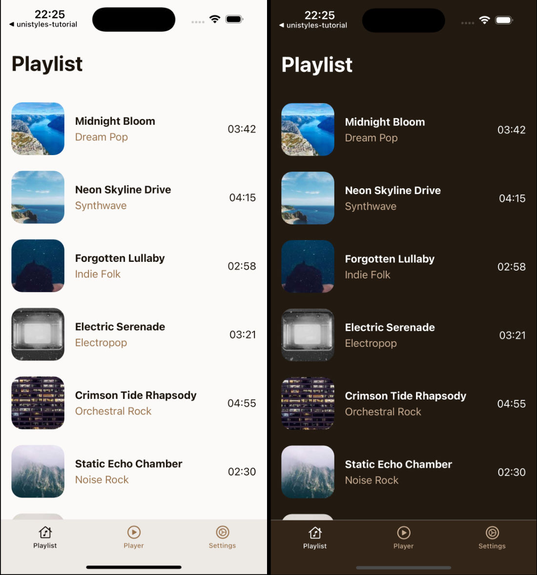
We now have a fully functional playlist screen that displays our 20 mock songs in an attractive list format. Each song shows its cover art, title, genre, and duration. Tapping any song will navigate to the player screen with that specific song’s ID. Screen properly handles safe areas and maintains our app’s theme consistency.
Building the Player Screen
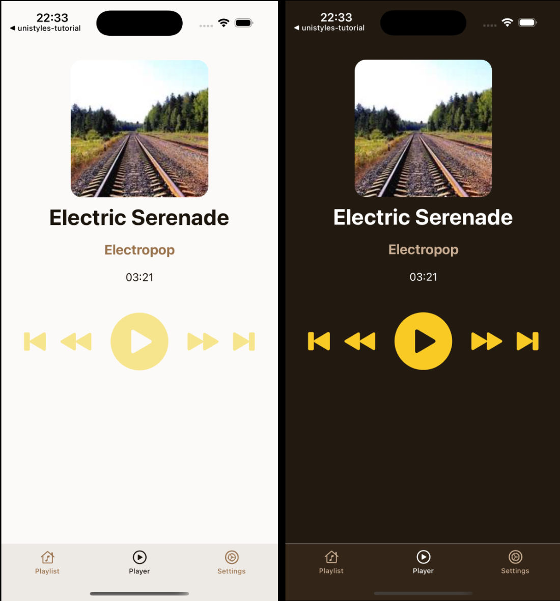
The player screen needs to handle dynamic routing, where the song ID comes from the URL parameter. This screen will display detailed information about the selected song and provide playback controls.
Let’s update our player screen at app/(tabs)/player/[songId].tsx to handle the dynamic song data:
 import { Button } from '@/components/Button' import { PlayerControls } from '@/components/PlayerControls'import { ThemedText } from '@/components/ThemedText' import { ThemedView } from '@/components/ThemedView' import { playlist } from '@/mocks' import { router, useLocalSearchParams } from 'expo-router' import { Image, ScrollView } from 'react-native' import { ScrollView } from 'react-native'import { StyleSheet } from 'react-native-unistyles'
export default function PlayerScreen() {   const { songId } = useLocalSearchParams()
   const song = playlist.find(song => song.id === Number(songId))
   if (!songId || !song) {     return (       <ThemedView style={[styles.centerContainer, styles.container]}>         <ThemedText type="title">           Looking for inspiration?         </ThemedText>         <ThemedText>           Pick a song from the playlist         </ThemedText>         <Button           label="Pick a song"           accent="banana"           onPress={() => router.replace('/')}         />       </ThemedView>     )   }
  return (     <ScrollView contentContainerStyle={styles.container}>       <Image         source={{ uri: song.imageUrl }}         style={styles.image}       />       <ThemedText type="title">         {song.title}       </ThemedText>       <ThemedText dimmed type="subtitle">         {song.genre}       </ThemedText>       <ThemedText>         {song.duration}       </ThemedText>       <PlayerControls />     </ScrollView>     <ScrollView contentContainerStyle={styles.container}>       <ThemedText type="title">         Player       </ThemedText>     </ScrollView>  );}
 const styles = StyleSheet.create((theme, rt) => ({   centerContainer: {     flex: 1,     justifyContent: 'center',     alignItems: 'center'   },   container: {     flex: 1,     gap: theme.gap(2),     alignItems: 'center',     marginTop: rt.insets.top + theme.gap(3),   },   image: {     width: 200,     height: 200,     borderRadius: theme.gap(2)   } })); const styles = StyleSheet.create((theme, rt) => ({   container: {     flex: 1,     marginTop: rt.insets.top,     paddingHorizontal: theme.gap(2)   }, }));
We use useLocalSearchParams() to extract the songId from the URL. This allows users to navigate directly to any song or bookmark specific tracks.
Notice the Button component uses the hardcoded “banana” accent. In the next part of the tutorial, we’ll make this dynamic based on the user’s accent preferences from the settings screen.
Our screen still needs one more component to be complete - the PlayerControls.
Creating the PlayerControls Component
The player controls provide the interface for music playback. While they won’t actually play music in this tutorial, they give users the familiar media controls they expect in a music app.
Let’s create the final component for our player interface:
import { IconSymbol } from '@/components/ui/IconSymbol'import { Pressable, View } from 'react-native'import { StyleSheet } from 'react-native-unistyles'import { useUnistyles } from 'react-native-unistyles'
export const PlayerControls = () => {    const { theme } = useUnistyles()    const accent = theme.colors.accents['banana']
    return (        <View style={styles.actions}>            <Pressable>                <IconSymbol name="backward.end.fill" size={40} color={accent}/>            </Pressable>            <Pressable>                <IconSymbol name="backward.fill" size={50} color={accent}/>            </Pressable>            <Pressable>                <IconSymbol name="play.circle.fill" size={100} color={accent}/>            </Pressable>            <Pressable>                <IconSymbol name="forward.fill" size={50} color={accent}/>            </Pressable>            <Pressable>                <IconSymbol name="forward.end.fill" size={40} color={accent}/>            </Pressable>        </View>    )}
const styles = StyleSheet.create(theme => ({    actions: {        marginTop: theme.gap(2),        flexDirection: 'row',        gap: theme.gap(2),        alignItems: 'center'    }}))
Like the Button component, we’re currently using the hardcoded “banana” accent color.
Perfect! You now have a complete music player interface that demonstrates many of Unistyles’ capabilities. Users can browse a playlist of songs, tap to navigate to individual tracks, and see a detailed player interface with media controls. The app maintains consistent theming throughout and handles navigation gracefully.
The hardcoded “banana” accent colors in both the Button and PlayerControls components are intentional placeholders. In the final part of our tutorial, we’ll connect these to the user’s accent preferences from the settings screen, making the entire app truly dynamic and personalized.